Berkeley Lab Logo
The Berkeley Lab logo represents a distinguished level of professionalism and should appear on all
communications materials and related items.
The symbol in our logo depicts two iconic campus structures: the Advanced Light Source at Berkeley
Lab and the Campanile at the University of California. This juxtaposition of familiar architectural
icons symbolize and establish the unity of these institutions into one entity known as Berkeley Lab
(a reduction of the longer, official, Lawrence Berkeley National Laboratory). The iconic buildings in our symbol represent the solid foundation on which we are built.
Combined with our logotype, the logo exemplifies the heritage and strength of our organization.
Our logo is comprised of two components—the symbol and the logotype. These components form the visual expression of our identity.
The logo has been carefully drawn and proportioned and should never be altered in any way.
Masterbrand Logo
The logo without the tagline is the preferred configuration. It’s always used for internal communications and whenever space allows.

Positive Logo
A positive version without tagline.

The logo with the tagline adds a third component and positions our tagline, “Bringing Science Solutions to the World,” below the logotype. The tagline configuration is for all external or public communications such as scientific posters and presentations.
Masterbrand Logo with Tagline
The logo with the tagline is used for external communications.

Vertical and Stacked
The vertical and stacked logos combine the logotype with the symbol for a more compact configuration. These logos are for use only in space restricted applications.

Reverse Variations
These variations are meant for limited use against a black or dark background. Don’t use the reverse variation on light colored backgrounds.


Color
Color is essential to visual identity and identity—at a deeper, cultural and institutional level. It’s about having a clear sense of common purpose and a sense of belonging, rooted in that purpose. Symbols, names, colors, and images are the visual assets that give tangible form and lasting expression to identity. Color unifies from within, as it distinguishes from without.
Primary Palette
Our primary palette consists of the dark blue used in our preferred logo, plus teal and two grays. Combined with black and white, these colors solidify and reflect our strength and innovation. The primary palette is used in a dominant manner in Lab-branded communications to give consistency and coherence to our design system.
All colors in the Berkeley Lab palette use precise color references, shown in the specifications on this page. Always use the exact values listed, which correspond to the medium being employed.
Don’t use color references or values from files that have been converted automatically between color modes. Some software programs don’t always make color conversions that are equal to the values listed in the palette specifications. Slight variances in color may occur when printed through different processes or reproduced in different media.
 |  |  |  |
| DARK BLUE PMS 547 CMYK 100 35 32 82 RGB 0 49 60 HTML 00313C | TEAL PMS 7474 CMYK 96 9 32 29 RGB 0 118 129 HTML 007681 | LIGHT GRAY PMS Cool Gray 5 CMYK 13 9 10 27 RGB 177 179 179 HTML B1B3B3 | DARK GRAY PMS Cool Gray 10 CMYK 40 30 20 66 RGB 99 102 106 HTML 63666A |
Secondary Palette
Our secondary palette gives designers greater flexibility in creating branded materials.
While our primary palette consists of cool tones, the secondary colors introduce warmer, more vibrant values—adding variety to keep materials from looking homogeneous. These colors are used as accents on elements such as information graphics, charts and graphs.
 |  |  |  |  |
| ORANGE PMS 1385 CMYK 2 56 100 3 RGB 213 120 0 HTML D57800 | GREEN PMS 7489 CMYK 56 2 78 5 RGB 116 170 80 HTML 74AA50 | YELLOW PMS 124 CMYK 0 30 100 0 RGB 234 170 0 HTML EAAA00 | RED PMS 7417 CMYK 1 83 85 0 RGB 224 78 57 HTML E04E39 | DUSTY ROSE PMS 486 CMYK 0 55 50 0 RGB 232 146 124 HTML E8927C |
 |  |  |  | |
| OLIVE GREEN PMS 618 CMYK 14 10 85 27 RGB 172 159 60 HTML AC9F3C | BLUE PMS 7459 CMYK 72 9 9 13 RGB 66 152 181 HTML 4298B5 | PURPLE PMS 7447 CMYK 77 85 6 18 RGB 93 71 119 HTML 5D4777 | BURGUNDY PMS 7643 CMYK 0 84 2 70 RGB 103 46 69 HTML 672E45 |
Typography
Clean, modern, legible typography is fundamental to the precise, effective conveyance of information. Symbolic notation, alphabetic characters, numerals, icons, are the very ‘form’ of information and the medium of knowledge.
Berkeley Lab is first and foremost an institution about scientific and technological information, about the advance of knowledge, and its essential role in solving fundamental human, ecological, and intellectual problems. Therefore, typography—the use of strong, modern, letterforms and faces—is one of the most important elements in Berkeley Labs’ visual branding toolkit.
We’ve chosen several typefaces for all of our communications — both serif and sans serif. Used together, these fonts combine classic looks with a contemporary feel.
Primary Typeface
Our primary typeface is ITC Franklin Gothic Std. This sans serif font is used for headlines, titles, body copy, pull-quotes, sidebars and captions. It’s our preferred typeface and should be used whenever possible. If you do not have a license for ITC Franklin Gothic, you may use the free Google font Libre Franklin.
Use only the cuts and weights shown. Italics should be used sparingly, for emphasis only.
It’s suggested to limit use of the condensed cuts and weights to legal text and footnotes.
For projects produced outside Creative Services, licensing options are available here.

Secondary Typeface
Our secondary typeface is Transitional 511. This serif font complements our primary font, ITC Franklin Gothic Std and is used for large amounts of body copy.
Do not use this typeface for headlines or titles.
For projects produced outside Creative Services, licensing options are available here.

Default Typefaces for Print
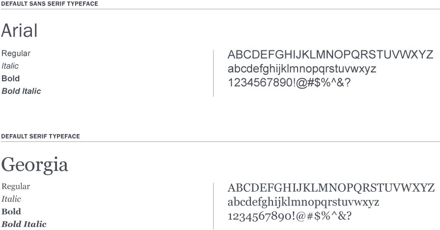
Arial is our default sans serif typeface. Use Arial only when it’s not possible to use Franklin Gothic, our primary typeface.
For example, Arial is used for Microsoft Powerpoint and all Microsoft Word documents—such as faxes, memos and press releases—to ensure consistency when distributing files across workstations and platforms.
Georgia is our default serif typeface. Use it only when it’s not possible to use Transitional 511, our secondary typeface.

Use only the cuts and weights shown. Italics should be used sparingly, for emphasis only.
It’s suggested to limit use of the condensed cuts and weights to legal text and footnotes.
